
Have you ever found yourself lost in a sea of numbers? Hundreds of individual data points floating around you but nothing solid to grasp? If only a visually arresting graphic could emerge from the digits. Suddenly everything would make sense.
Earlier this year we learned that using the right graph is instrumental to communicating why your data matters. Let’s explore new possibilities in the world of data visualisation with four new types of graphs. The graphs that I have provided have a theme. See if you can spot it. Join me as we embark on a journey through time and space! But be careful. It can be a dangerous trek with plenty of pitfalls.
Graph 5 – Change over Time
When your data has been through many changes, it’s time to think fourth-dimensionally! That is, think with time in mind. A change over time graph can visualise the ups and downs your data has undergone in a chronological sequence. Depending on your time scale, you can guide readers on a path through history, or show them how things have changed over the course of hours or seconds (for instance, a seismograph recording of an earthquake).
A line graph is a common example of a change over time graph. I’m sure you’ve all seen one before. The x-axis tells you when and the y-axis tells you how much. This visualisation can be used to highlight trends, make comparisons between different variables during the same moments in time, or identify points in time when everything changed.
The line graph below shows the number of arrivals and departures to Australia over a 10-year period. It allows us to see a repeating annual pattern, a year-on-year increasing trendline and, most strikingly, the massive drop-off when travel restrictions were implemented during the COVID-19 pandemic.
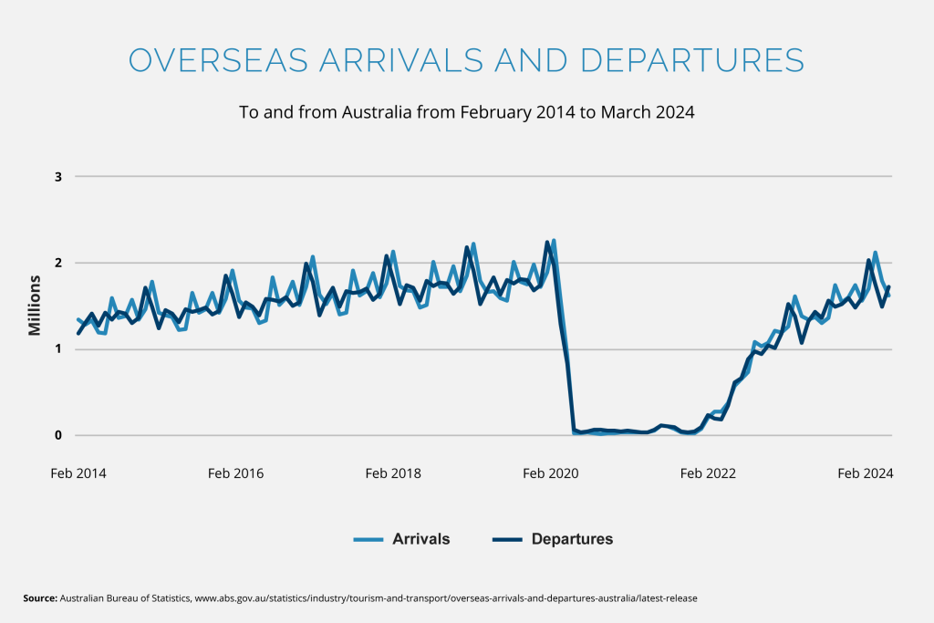
Use this type of graph when you want to tell a story about changes. The graph could communicate progress, things becoming worse, or an interesting pattern that is likely to repeat. Always consider the start and end point of the data you want to visualise. Avoid misleading the reader by focusing on a smaller portion of the data that obfuscates the larger whole. Provide a suitable amount of context so the reader is informed but not overwhelmed.
Graph 6 – Spatial
Now that we’ve covered the when in our data, let’s look at the where. If your data contains location-based information, you may benefit from using a spatial graph. These graphs encode geographic data onto a map, so you can see the differences in values based on where the data comes from.
A contour map is an example of a spatial graph. Areas of equal value are visually connected to each other through lines, colours or patterns. In the case of altitude or rainfall, a range is often used to create discrete categories from continuous data. In the graph below, we can see the areas of Australia which have received proportionately similar amounts of rain in the last year.
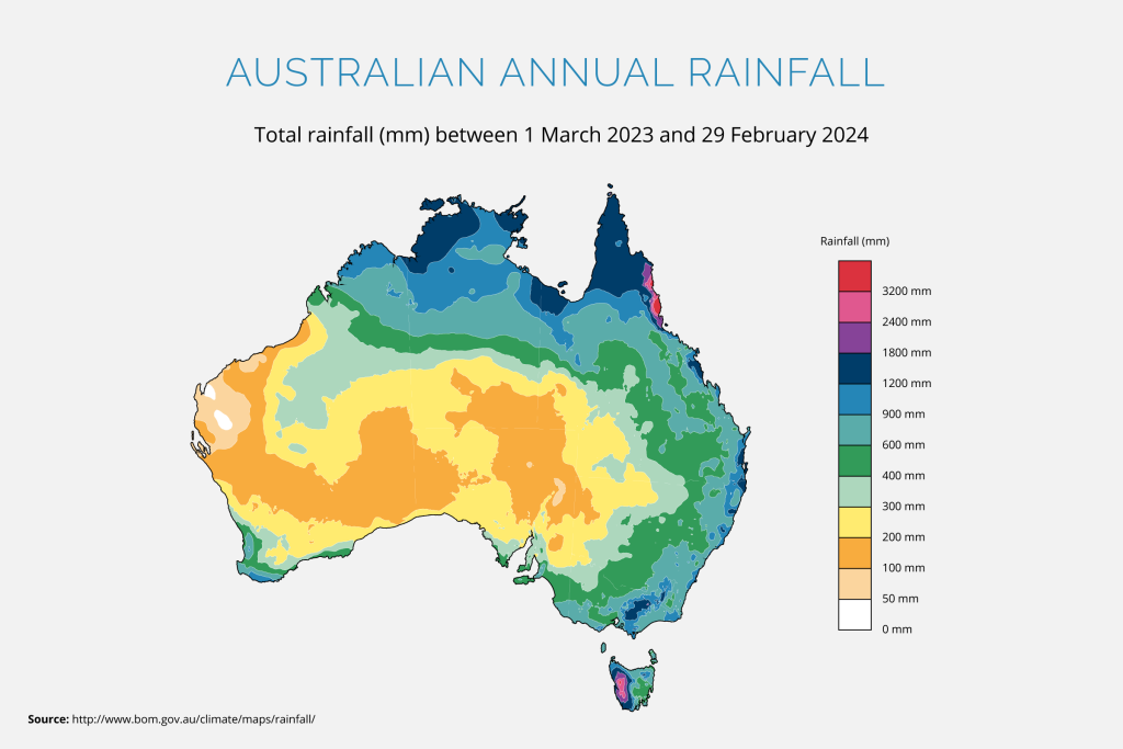
Remember that when representing population-related data spatially, it’s often more appropriate to use per-capita values rather than absolute population values. Nobody wants to see a spatial graph that is virtually identical to a population map. This tells us very little about the data!
Use this type of graph only when precise locations are available and when geographic patterns are a key part of what you’re communicating. Just because you have location data, doesn’t mean you should automatically jump to using this graph type (other aspects of the data may be more salient than the location). Matthew Ericson’s article When Maps Shouldn’t Be Maps provides more detail about when to use spatial graphs and when to set them aside.
Graph 7 – Correlation
If your data contains multiple variables and you suspect that there might be a link between them, your data might benefit from being correlated. A correlation graph visually communicates the relationship between two variables.
A scatterplot is a common type of correlation graph. Each variable is represented by its own axis, so a single point in 2D space communicates two factors at once. This visualisation technique allows patterns to emerge; clusters in particular areas or general trends in the data can become apparent. For example, the graph below shows a strong correlation between a nation’s Gross Domestic Product (GDP) per capita and their carbon dioxide (CO2) emissions per capita.
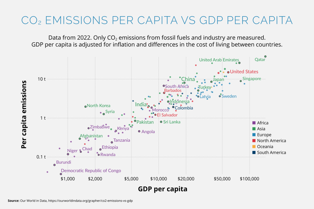
Use this kind of graph to identify anomalies, to communicate how one variable affects another, or to visualise a correlation, pattern, trend, or relationship. However, I must mention the axiom “correlation does not equal causation”. Just because two variables are linked doesn’t mean that one is affected by the other. Sometimes a third (perhaps unmeasured) variable is the cause of change. Even if you’re aware that there isn’t a causal link between your graphed variables, be careful. The presentation of the data, even just placing both variables in proximity, can imply a causal relationship to the reader.
See Alberto Cairo’s article Graphics That Seem Clear Can Easily Be Misread for an example of a poorly-made scatterplot. This graph implies that life expectancy in a country increases as the obesity rate increases, when in fact both variables are much more closely linked to income level.
Graph 8 – Distribution
Sometimes your data might be like a jam (bear with me). You can get a better sense of it by spreading it out. Will you get an even spread over your slice of bread? Or will the metaphorical jam clump together in interesting ways that tells us more about your data? A distribution graph lets you see the spread of your data. The values can be plotted out and the shape (sometimes called the ‘skew’) of the graph can highlight a lack of equality in the data.
A population pyramid is an example of a distribution graph. This kind of graph visualises a population’s age, disaggregated by sex, and is usually presented as two back-to-back histograms. Since population sizes tend to decrease as the population increases in age, the graph usually tapers upwards to a point, giving it a pyramid-like shape. The example below compares the age distribution of Australia’s population with India’s. The visualisation allows us to easily see that Australia has a higher percentage of people in older age brackets.
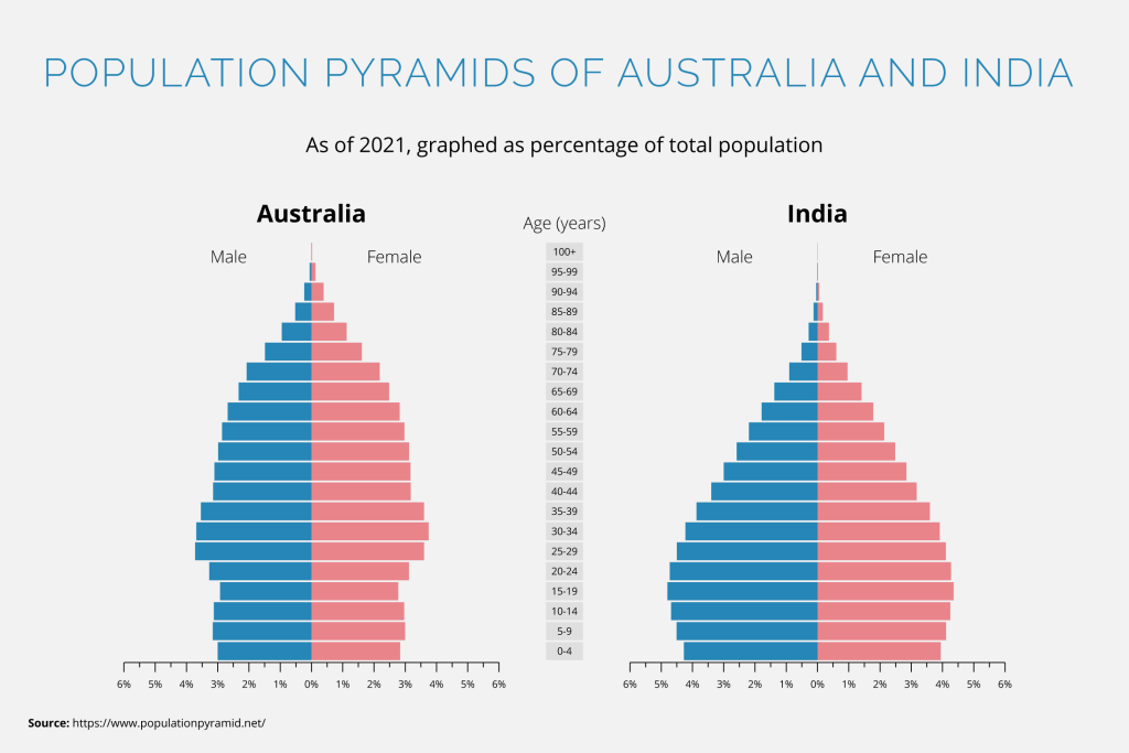
However, even this graph type is not without its faults. Dr. Randal S. Olson’s article Rethinking the Population Pyramid explains the shortcomings of this graph’s standard presentation, depending on what you want to communicate with it. The graph may be good for showing a general overview of a given population but is poorer at comparing gendered data within that population.
Use this kind of graph to communicate that your data aligns to an expected average (e.g. a standard bell curve) or use its unique shape to show that the data lacks uniformity (e.g. it is skewed in one direction or there are significantly large outliers).
Summary
Did you spot the theme? I’ve highlighted ways graphs can be used incorrectly to be, at best, unhelpful and, at worst, outright misleading.
Data visualisation is a powerful tool. And with great power, comes great responsibility. Think critically about what you’re communicating and what your graph implies, whether intentionally or not. Be aware of unintentional biases, not only in your data but also in the way you choose to present it.
This post was inspired by The Financial Times’ Visual Vocabulary diagram. It provides a great breakdown of different chart types and has many great examples of additional graphs for each category.