
We’ve all been there. You’ve got a spreadsheet full of numbers, but the monotonous rows and columns don’t spark joy.
How can you compel your audience to appreciate the value of your values? This is where graphic design can come to the rescue. You ought to visualise that data!
Before you start, make sure you use the right tool to communicate to your audience. The type of graph you choose depends on two things: what your data represents and what you want it to say. Keep these in mind as we explore four possible graph types that may be right for your needs.
Graph 1 – Magnitude
Magnitude graphs are a simple technique to make your numbers pop off the page. A reader may be able to tell that 2,224,475 is bigger than 1,418,455.
However, by visualising these values as a length or area of a shape, the reader can intuitively understand the size comparison. An example is the simple bar (or column) graph below. It’s an effective visual aid for understanding the relationship between different numbers.
Compare the table of values on the left to the bar graph on the right. In this graph, the highs and lows are immediately identifiable, and we get a general sense of the overall length for each value – are most numbers similar in size, or do they vary wildly?
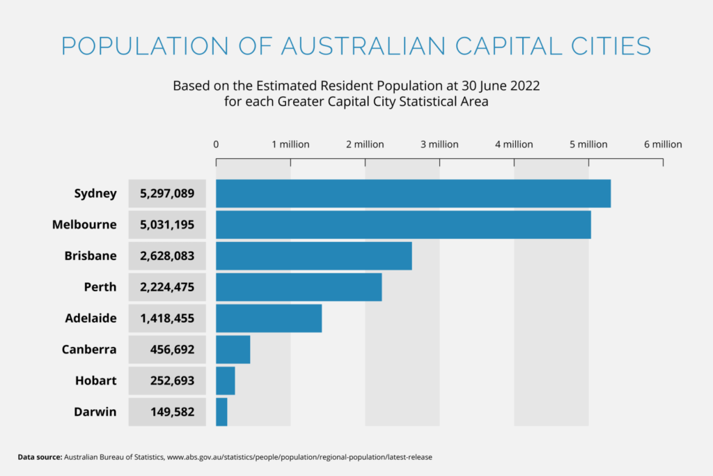
Use this kind of graph when you’re comparing amounts or volumes, and when you want to communicate how they are similar or different.
Graph 2 – Part-to-Whole
A part-to-whole graph breaks down a quantity into its components. Similarly to the magnitude graph, we’re comparing value sizes, but instead of just comparing them to each other, we’re comparing them to the total amount – 100 per cent.
The humble pie chart is a good example of this. It’s a great visual shorthand since we understand a full circle as representing the whole and each sector (or slice) being a part of it. We intuitively see that larger values are represented by larger slices of the pie.
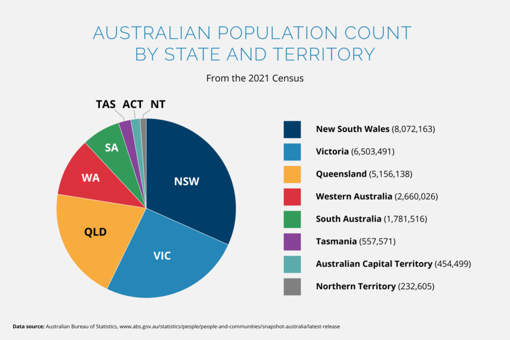
Use this kind of graph when you’re comparing a smaller part to the big picture. Perhaps you want to communicate that a component is much smaller than it should be, or perhaps it takes up a surprisingly significant piece of the pie.
Graph 3 – Flow
We’ve demonstrated two easy graph types. Time for something more advanced.
If you want to show that your data has changes in volume or intensity between multiple states or conditions, consider going with the flow. The flow graph, that is. These different states can include change over time, change in location, or change from one category to another.
A popular type of flow graph is the Sankey diagram (named after the Irish engineer Captain Sankey). The width of each line encodes the value of the data and the line’s location denotes the different states. Our eyes can follow the paths each line takes to see how the data changes as the conditions or categories change. You can almost think of a Sankey diagram as being multiple part-to-whole diagrams (e.g. pie charts) joined together. The interconnected lines demonstrate how the values correspond between each change of state.
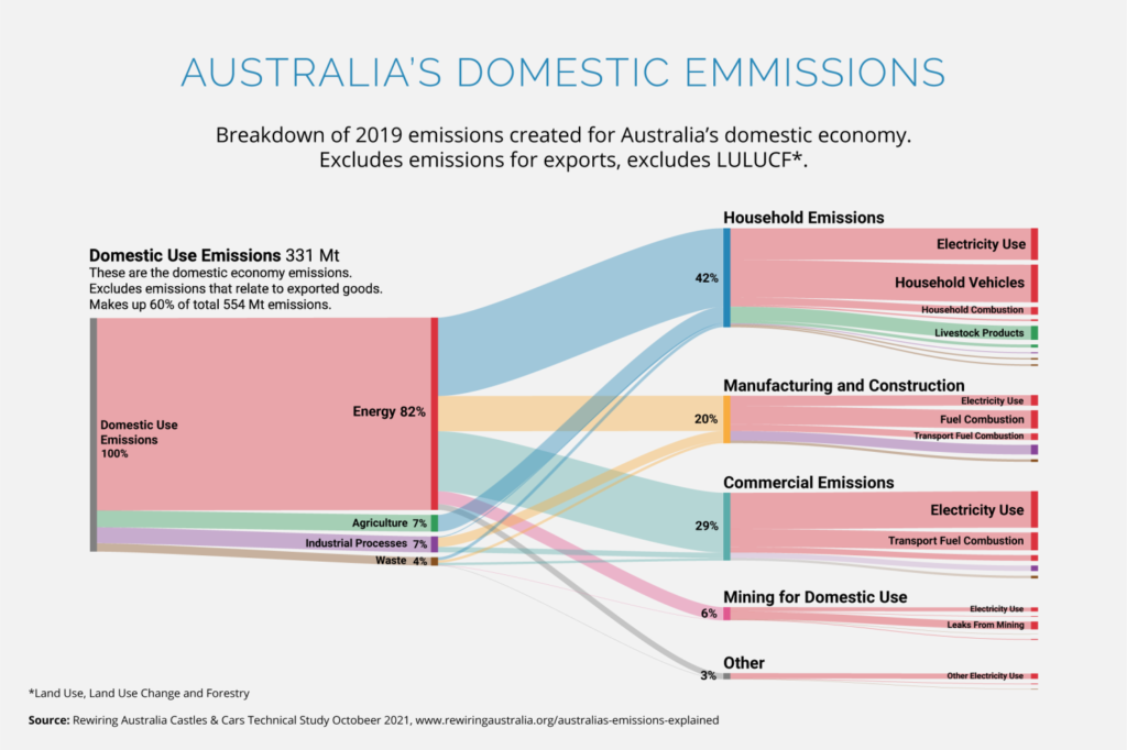
Use this kind of graph when the change in your data is what you want to focus on. You could use it to highlight a significant change in proportion, or to communicate an at-a-glance understanding of a complex system.
Graph 4 – Deviation
If you think your data is a bit devious and doesn’t follow the norm, then deviation is the right graph for you. These graphs compare every point of data to a baseline – a fixed reference point. This could be zero or an established average. A good example is a diverging bar graph. It’s similar to the simple bar graph, but instead of counting up or down an amount, we’re counting the difference.
The website #ShowYourStripes displays temperature data from around the world as a diverging bar graph. On the graph below, the baseline is the average temperature from 1971-2000. We can intuitively see when temperatures were colder or warmer than this average. This particular graph also colour-codes the data – darker reds and blues are used for higher or lower temperature deviations.
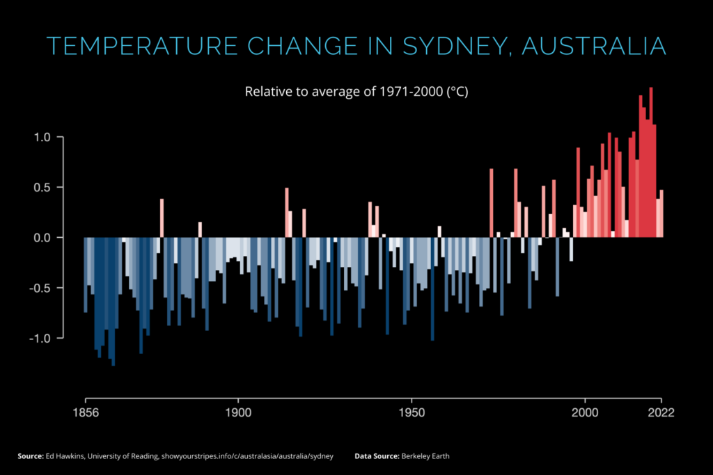
Use this kind of graph when you want to emphasise how much your data varies from an expected average. Use it to visually communicate the direction and intensity of trends that might otherwise be lost in the data.
Summary
You’ve probably noticed I’ve used the term ‘intuitively’ a lot in this post. That’s intentional. Great design is about making things effortless for the reader. Where monotonous-appearing numbers are hard to comprehend, shapes, sizes, colours and positions are much easier for most of us to grasp. In the same way a picture can paint a thousand words, a graph can paint a thousand numbers. Graphs are a useful communication tool. If you use the right type for the right job, you can communicate observations and ideas in an informative and engaging way.
This post was inspired by The Financial Times’ Visual Vocabulary diagram. It provides a great breakdown of different graph types and has many more great examples of graphs for each category.