Communication relies heavily on how your content resonates with your audience – how do they feel after engaging with you? Do you want them to feel educated? Engaged? Angered? Inspired?
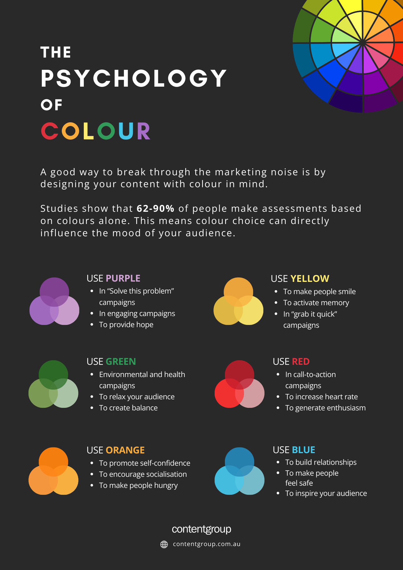
Breakthrough the noise by designing your content with colour in mind. Studies show that 62-90% of people make assessments based on colours alone. This means colour choice can directly influence the mood of your audience.
It’s important to note that colour theory is a complex topic. Although there is a general pattern of emotion found in individual colours, it is hard to say one colour results in a specific behaviour because, ultimately, colour is associated with personal experiences.
Below is a general guide for colour in marketing that shows worldwide associations, famous logos, common places you may see the colour used and my personal recommendations for each.
Yellow
Associations: Motivating, warm, optimistic
Logos: Optus, IKEA, Commonwealth, McDonald’s, R U OK?
When to use: To make people smile, to activate memory, in “grab it quick” campaigns
My recommendations: Yellow is physically hard on the eyes and, when overused, can subconsciously make us frustrated. But, carefully placed yellow will make your audience feel positive and hopeful.
Orange
Associations: Togetherness, support, friendliness
Logos: Firefox, Eventbrite, Blogger, Fanta, Nickelodeon
When to use: To promote self-confidence, to encourage socialization, to make people hungry
My recommendations: The wrong shade of orange can come off as harsh- softer shades generally have a more favourable reaction with audiences. By choosing the right shade of orange, your content can work wonders.
Red
Associations: Bold, impactful, passionate
Logos: Qantas, Netflix, Coles, Holden, Australian Post
When to use: In call-to-action campaigns, to increase heart rate, to generate enthusiasm
My recommendations: Use red sparingly. Red is a “show-stopper” colour and too much can come off as arrogant and egotistical. A little goes a long way with red!
Blue
Associations: Calm, dependable, trust
Logos: Facebook, Big W, ANZ, CSIRO, Stan
When to use: To build relationships, to make people feel safe, to inspire your audience
My recommendations: Blue is the most popular colour in the world, but overuse will make people feel physically tired or cold, and sometimes melancholy. Appropriate use of blue will allow your audience to gain confidence and trust in your brand.
Green
Associations: Healthy, harmony, growth
Logos: Spotify, Android, Woolworths, Australian Made, Subway
When to use: Environmental and health campaigns, to relax your audience, to create balance
My recommendations: When using the wrong shade of green, people may feel sick (hospital gowns are a good example of association). Green can also be seen as greedy because it is associated with American money. But generally, worldwide, green is associated with the earth and encourages us to grow and be healthy.
Purple
Associations: Creativity, wisdom, imagination
Logos: Cadbury, Telstra, International Women’s Day, Yahoo, Relay for Life
When to use: In “solve this problem” campaigns, in engaging campaigns, to provide hope
My recommendations: Although purple encourages people to be hopeful and creative, it can cause our minds to wander and distract the audience from your content’s purpose. Use correct contrast with purple and keep your content to the point to get the reaction you want from your audience.
Sources:
- McLeod, J. (2016). Colour Psychology Today. 1st edition. Croydon, UK: CPI Group.
- https://www.koozai.com/blog/content-marketing-seo/psychology-colour-marketing/
- Satyendra Singh, (2006) “Impact of color on marketing”, Management Decision, Vol. 44 Issue: 6, pp.783-789, https://doi.org/10.1108/00251740610673332